TABLES

Table is typically the final outcome of your data analysis. However, tables are not effective at representing large sets of data, as they require time to extract the relevant information and compare values.
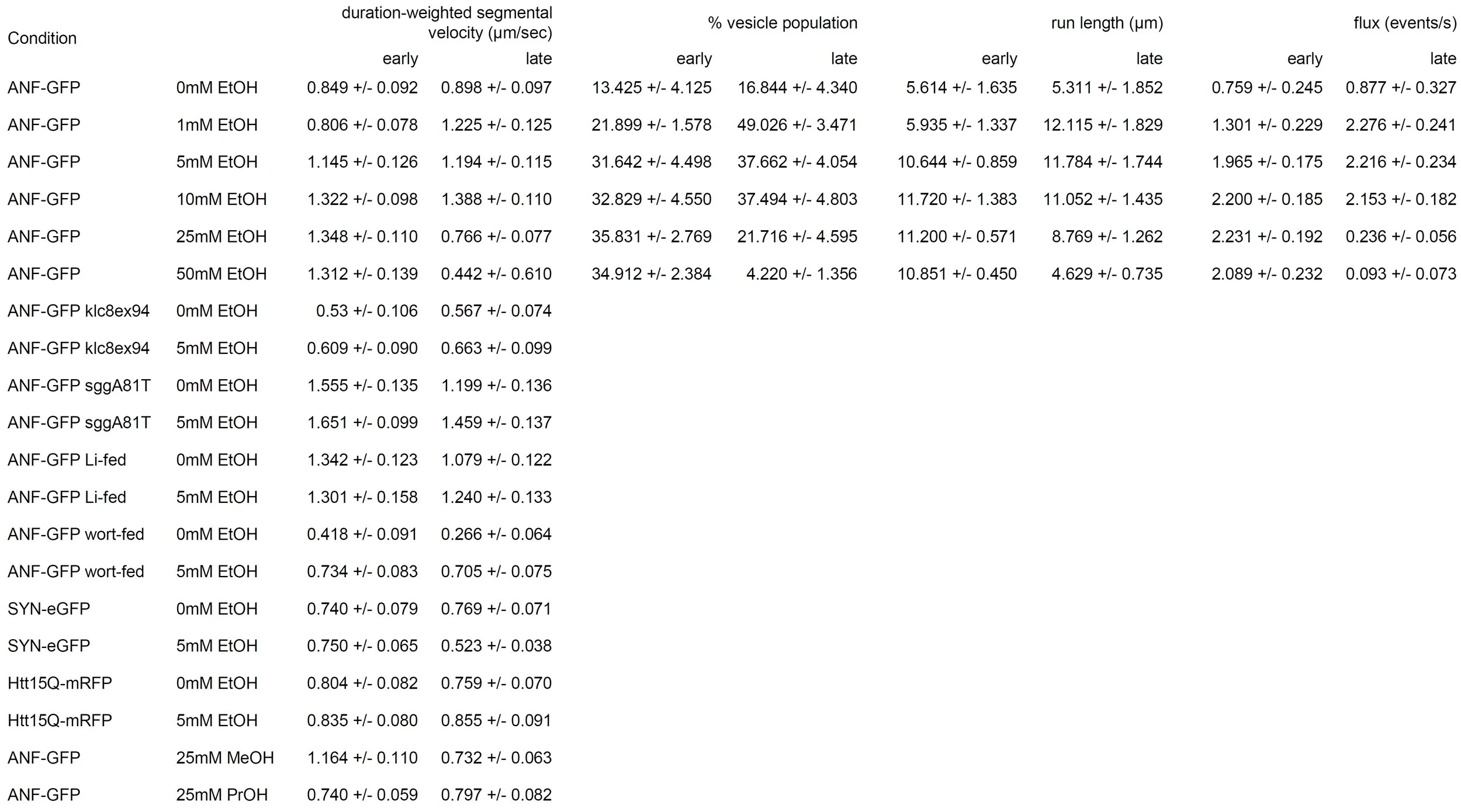
This is why, for most of us, table is a beginning of the visualization process, not the final outcome. So whenever I see a table like this one from Iacobucci et al. 2017

my first instinct is to turn it into a graph (either bar or linear):

First column of the table turned into a set of bar graphs.
However I can imagine that you like tables, or your PI likes them, or it's your supplementary data and you are less inclined to put effort into its representation (not that this is a good reason).
If any of the above is the case (or you have some other reasons) there are basic rules you should follow when preparing a table. Note, that those rules apply to all kind of tables whether they contain numbers or text.
1) align
2) remove non-data ink / add white space
3) highlight / add visual cues
So, let's start again with the original table:
1) align
By aligning the numbers and standard deviations the table looks much cleaner. However, I doubt you can read well the actual numbers, even if you are reading this post on your desktop. This is because there is a lot of text, that doesn't need to be there. Which brings us to the next step:
2) remove non-data ink/add white space

I removed all the extra text (ANF-GFP, EtOH) and rounded the numbers to two decimal places (or 1 in case of numbers over 10). Yes, your calculation may give you more, but are they meaningful? Finally, I added some "breathing" white space between sections to reduce the overwhelming feeling you get when faced with a lot of data.
Overall, this allowed me to increase the font size and therefore the numbers are now readable (on desktop!).
3) highlight
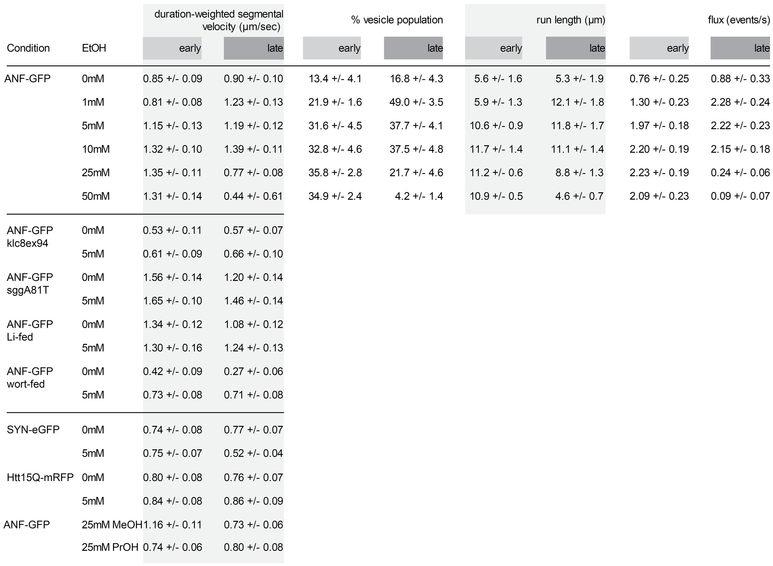
This is a very delicate highlighting, done to create some structure, which helps focusing attention on individual columns.
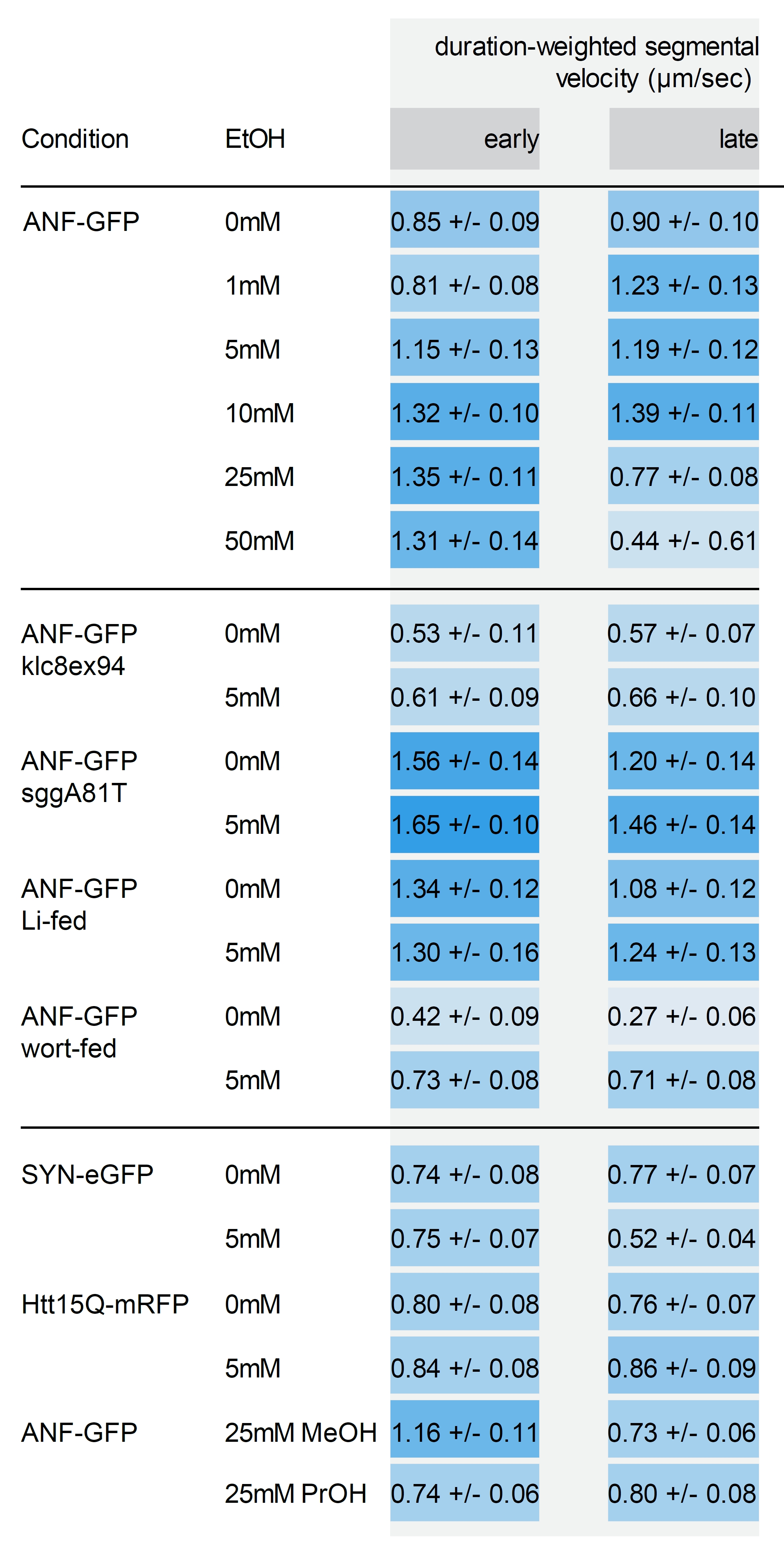
Alternatively, you can add extra visual cues to help audience identify high and low values. For this I selected the minimum and maximal values and created 10 bins with assigned color lightness. Higher values fall in the darker categories, lower in the lighter.
Finally, I wanted to point you out to a video I found on Twitter which deals with a similar topic. It's a slightly different approach, but carries the same message.