ALIGNMENT

Human brain likes patterns. We are tend to search for them into everything we see.
If you consciously pay attention to it in your figure design, your reader will be able to focus on the data, rather than looking for a pattern. Right now you are probably thinking of lining up your graphs and schemes, but you should also keep it in mind when it comes to images.
To illustrate this I am going to use an example from a paper by Parrinello et al.
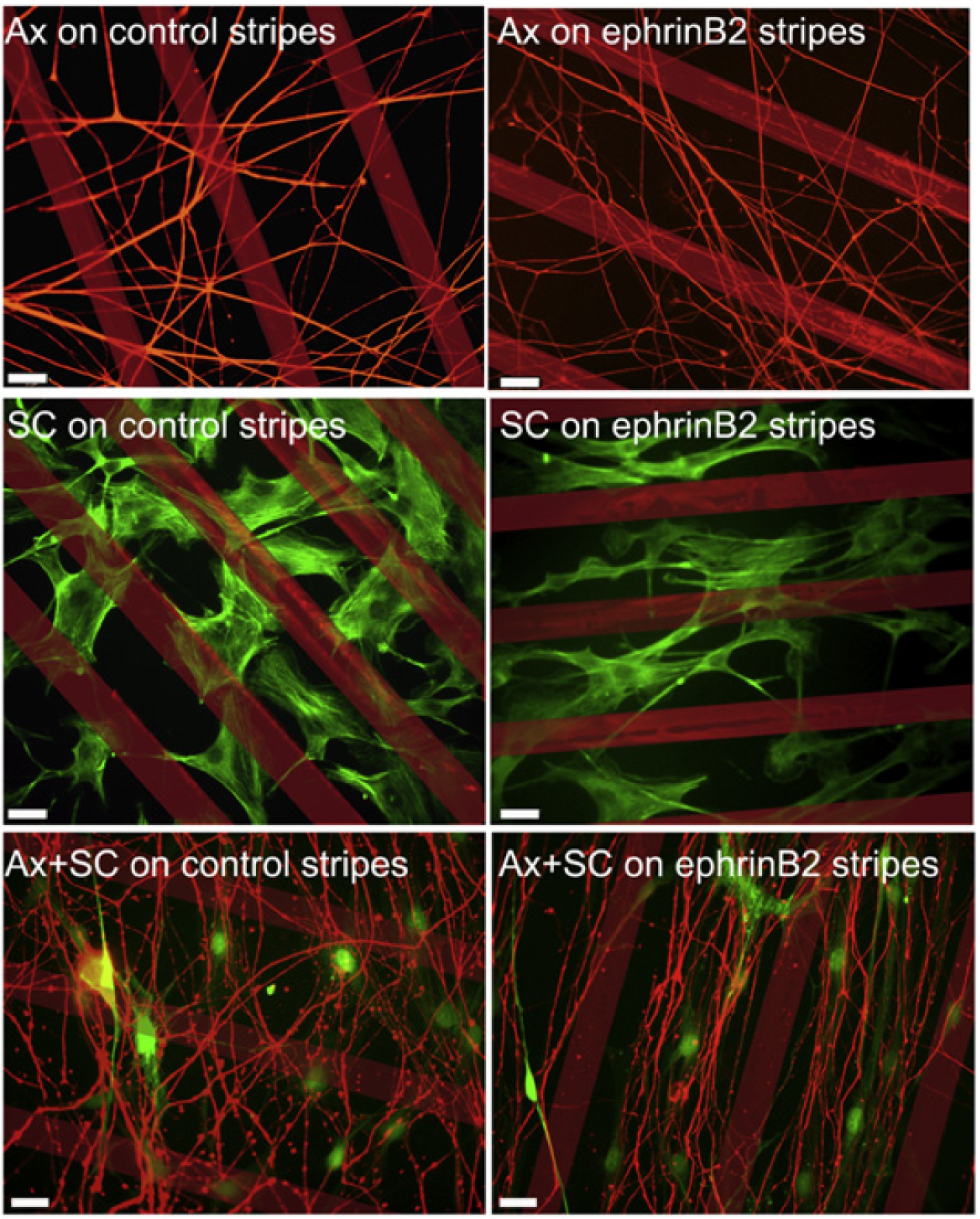
I still remember discussing this article at the journal club as a graduate student. My supervisor was presenting and just as he was about to switch to the next slide, he said: wish they just had aligned the stripes.
And indeed wouldn't you see the effect better if in all of the images stripes where horizontal? It almost automatically becomes obvious in which conditions cells avoid growing on stripes and when they are able to cross.

I am working here with images copied from the .pdf, so my options are limited, but ideally you would also try to change look up tables and assign different color to stripes and cells.
For example the first panel would look like this, with the most important signal is in white (best contrast)

As usual these are small changes, but very impactful.