GRAPHICAL ABSTRACT

Graphical abstracts are relatively new in the publishing world, and as a very visual person I really like them. The purpose of the graphical abstract is exactly the same as of the written one: to encourage the audience to read more. Therefore, it should be a brief summary, highlighting only the main findings.
Giving specific advice on making graphics is not an easy task. It is quite often a question of style and personal preferences. However, there are some basic rules that when applied will increase the impact of your abstract:
1) focus on your message. I recommend first writing the regular abstract and then visualizing only this information. If you try to squeeze too much, the reader will not be able to extract information of the article’s topic.
2) flow of the graphic. We are automatically trying to read information from top to bottom, or left to right. Arranging the flow differently may cause some confusion as to what comes first and where to begin.
3) less is more. As you might have noticed in previous posts I am a big fan of this rule. I like simple forms, sparsely (but wisely!) used colors and clean lines. There is a good reason for it. On one hand using flashy colors attracts attention, but on the other if you use too many you will achieve the opposite effect.
For this makeover I chose the graphic abstract from Nirschl et al.

It is a very busy abstract, with a distorted flow and flashy colors. Even though you can still get the message after studying it for a while, it would benefit from some improvements.
Let’s try to take it one issue at the time:
1) BUSINESS
There are so many colorful elements in the original (including the background) that it is hard to figure out which one is important. Similarly to what I've done for the schematics makeover, it's good to start with some sketching and design of individual elements.
First, the cells. On the graphic they are differently colored (left), but only one color is annotated in the legend (right). What do the other colors stand for?

I suggest changing it to a much simpler design. Here, each color represents a different monocyte type, properly explained in the legend. Moreover, I purposely highlight the dendritic cells by assigning them a “flashy” color. Afterall, they are the main focus of the paper.

Second, the transcription programs.
I didn't like the choice the authors made to represent activation of a transcription program, as, even though it is one of the main findings of the paper, it is too subtle.

I struggled for some time to think of a better solution. As IFN program is induced by IFN presence, I thought of using these diffused circles:
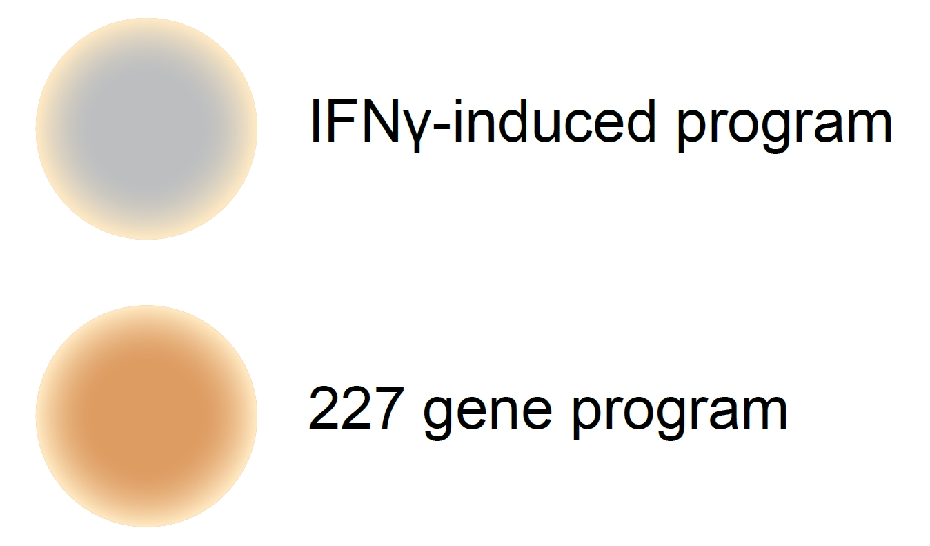
While they work well for IFN-induced program it is more problematic with the 227 gene program. Furthermore, after reading the paper it became obvious that there is a close relation between those programs, but depicting it in the abstract would cloud it too much. So I stick with the circles.
Third, the origin of the monocytes.
This is one of the busiest sections of the original graphic, at the same time one of the least important ones.

As a matter of fact all you need to know at this point of reading a paper, is that 227 gene program is activated in differentiating cells. There is no need for all those small icons of the organs. Taking it away will stop eyes from wondering around and focus on the main message. Here are some alternatives:

2) FLOW
The abstracts reads as follows:
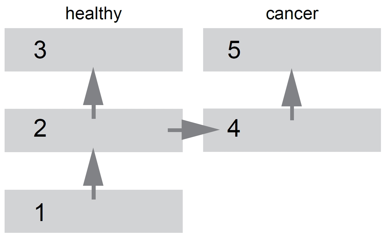
As I mentioned before this is not a flow we are used to and therefore it takes a moment before you start to navigate properly. It would be much easiest if it was rotated, as follows:

You probably also noticed that I removed number (5) - a knockdown of the SOCS2. Why? I believe that this is part of the used methodology and as such doesn’t really add anything to the overall message.
3) FINAL ASSEMBLY
Now that I settled on all of the individual pieces, it is time to assemble them all together.

I refrained from using original cyan and yellow and used classic encoding for “good” and “bad”, namely green and red. Also, rather than using small arrows I used the big and bold ones and added text to help the reader follow the processes.
In this last bit I wanted to share screenshots of the mid-stages of this makeover. They show that it's not easy to get everything right in the first attempt and making good graphics is about trying, editing and getting feedback.


