PIE CHARTS

It's time to address the elephant in the room - pie charts.
They are probably one of the most common way of visualizing part-to-whole relationships. Despite their commonality they are actually not great for depicting and comparing values. Take a look at this example from Lin et al. 2017:
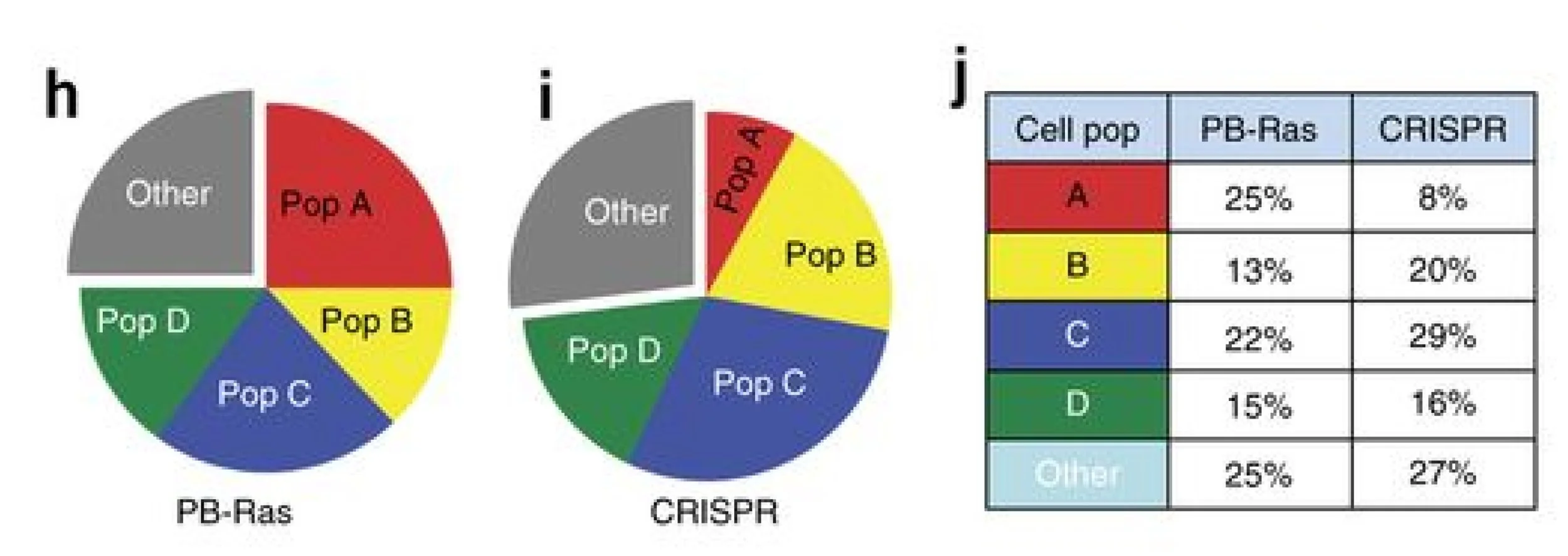
This is definitely one of the simpler versions of a pie chart with just 5 categories. However, it seems even the authors didn't have much confidence in their reader being able to get the values right so they added an extra table...
So why are pie charts ineffective? This is because we are forced to judge the values by the change in an angle.
By now you heard me talking a lot about how good or bad we are at judging lengths, angles, colors etc. So which ones are good and which aren't? In the table below you can see a summary of those and a little cheat-sheet if you are wondering what would you like to use for encoding your data:
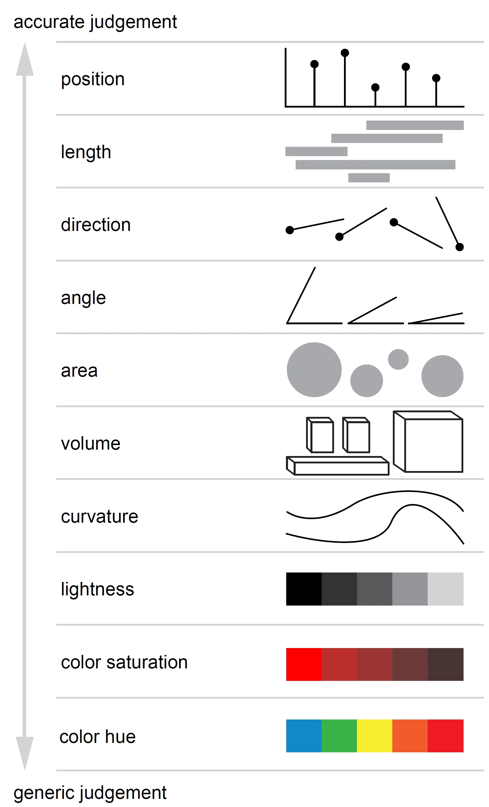
Elementary tasks ordered by accuracy (adapted from Cleveland & McGill, 1984; Journal of the American Statistical Association).
Coming back to the figure itself, here are a few ideas on how to make your pie chart better:
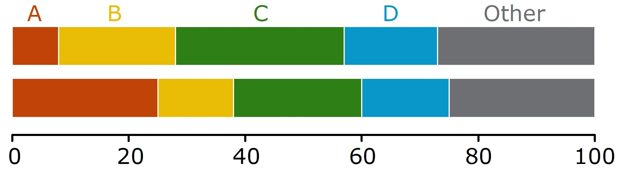
Stacked bar graph
Here, you are judging the length of each bar and even though they are not aligned I am pretty sure you can see a difference between 15 and 16% in "D" category:
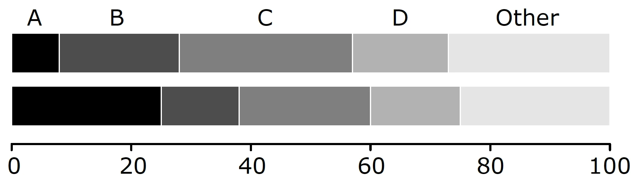
If you don't like to use different shades of one color you can play around with different saturations:

Or color:
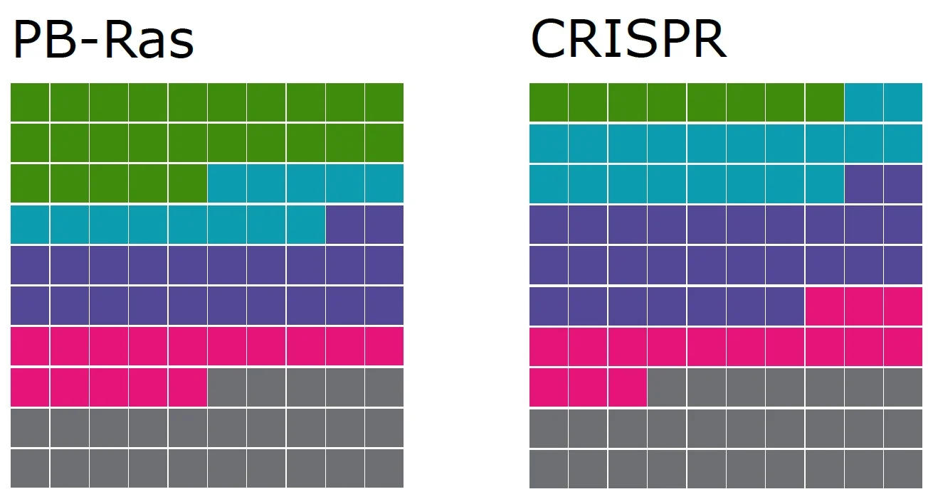
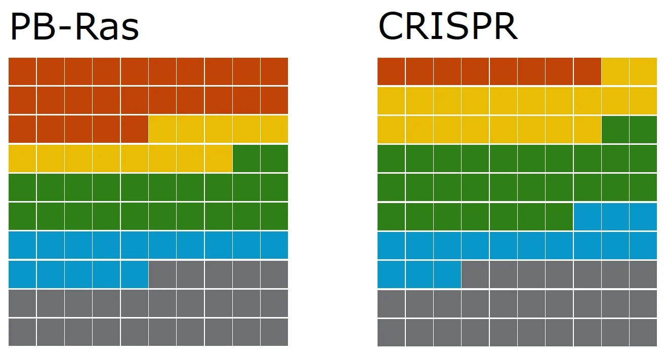
Waffel charts
Alternatively to stacked bar plot you can settle for a waffle chart. Here each tile represents one percent. I tried making waffle chart following the same rules as with stacked bar charts, but with so many categories (5) is is a bit harder to distinguish shades. So I had to try color:
If you don't like this classic red-yellow-green-blue, you can get more adventurous, just keep in mind that it's nice if neighbouring colors differ in lightness as it will make the boarders clearer: